I moved to North Carolina in 2011 and, as I’ve come to learn more about our politics, I’ve been struck by something that seems impossible: North Carolina has two separate realms of politics. In statewide elections, NC is split pretty much 50/50 between the two major parties. But in races where the state is split into districts, like the state legislature, the Republican Party controls a supermajority of seats (over 60%). With over 60% of the seats in the NC House and Senate, the Republicans can override the Governor’s veto, severely limiting the executive’s power.
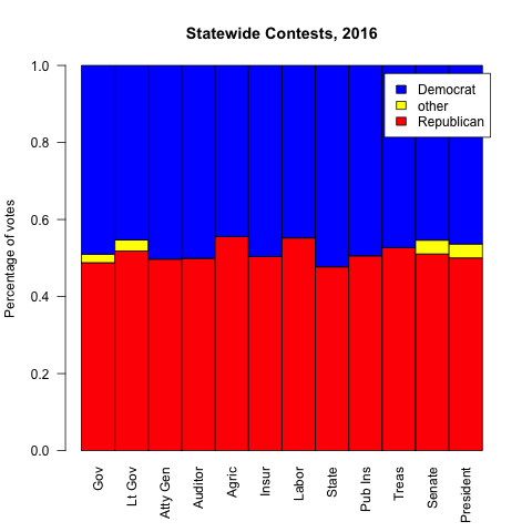
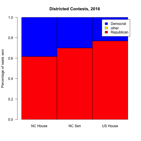
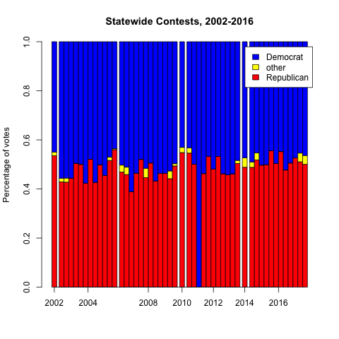
In the first chart are the statewide races – some are won by Democrats, some by Republicans, but they’re all within a couple percent of 50/50. In the second chart, we see the various districted houses in North Carolina, and all of them have 60+% Republican wins. I’ve spent much of the last year puzzling over how these two types of elections could produce such different results from the same voters. My background is in computer science and math, so I’ve tried to find an answer to this question the best way I can: using data.
Our state legisIature, the North Carolina General Assembly (NGCA), is elected every two years, as are our Congressional representatives. The US President and our statewide offices (Governor, Lieutenant Governor, Attorney General, etc) are every four years, and US Senators are every six years. So we have a lot of data to work with. I started by downloading the raw election result data for each of the previously-mentioned races for the last fifteen years from the State Board of Elections. (Before 2002, the data gets harder to access and less detailed).
What I found is that, before I moved here, elections weren’t quite so lopsided.
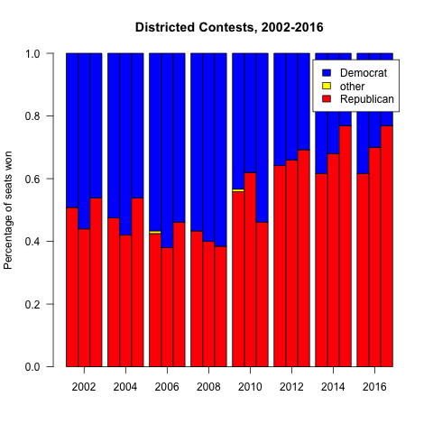 Clearly something changed, abruptly, between 2010 and 2012. I don’t think it was me moving to Charlotte. More importantly, it wasn’t that the electorate faced a massive shift between parties — if you look at statewide elections, the party splits stayed roughly the same. There’s some variability as you look at individual races, but you see they’re mostly within the 45-55% range.
 So what changed?
 These changed. Following the 2010 census, as happens after each census, district boundaries are redrawn in order to rebalance the shifting population across the districts. But in 2010, the Republican Party had just won control of the NCGA, so they got to control the redistricting process – the prior maps were drawn by a Democratic Party controlled legislature.
Now it’s important to understand how strategic redistricting works. If you want to skew the district map to your party’s advantage, you create a small number of districts with as many of your opponent’s voters as you can cram in (“packing”), and a larger number of districts with just enough of your voters to reliably win (“cracking”). If you’re unfamiliar, I’d recommend taking a minute to read Wikipedia’s primer, which has some helpful examples of why this is so effective. Also, fun fact, the first district they show as an example of egregious gerrymandering is the district I was in when I first moved to Charlotte, the NC-12th.
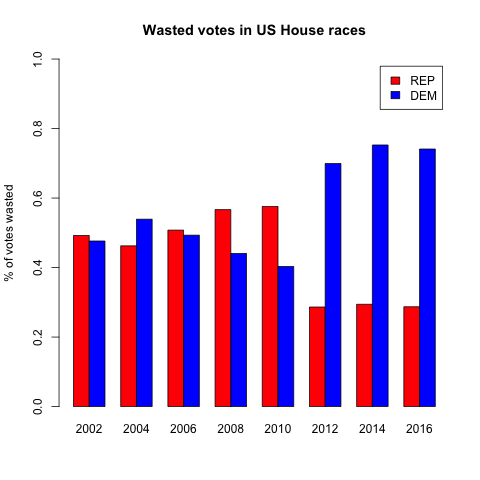
In any election, 49% of the votes are “wasted” — that is, they don’t contribute to the election of a candidate. This includes all of the votes for the losing candidate, and all of the votes for the winner past a simple majority. If you pack and crack effectively, you can skew the districts so that your party wastes fewer of its votes, and your opponent wastes more of their votes, and you can create a map where a 50/50 citizenry elects a supermajority of one party.
So the goal of gerrymandering is to waste as many of your opponents votes, and as few of your own votes, as possible. Let’s see if we notice any change in wasted votes after the 2010 redistricting. To keep the chart easier to read, let’s start with just one district map – the NC House of Representatives. Let’s look at the percent of votes that each party wasted.
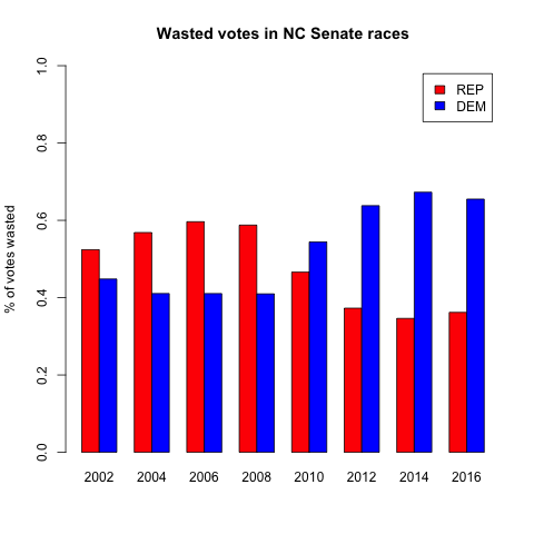
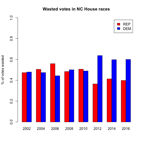 There it is — a pretty clear jump between close margins in 2002-2010, to very lopsided vote wasting in 2012 and later. And lest you think I cherry-picked the worst map, I actually chose the least dramatic. The NC Senate and US House results are even more lopsided.
 In case you’re not a chart person, here’s what that last one says — since 2012, the Congressional maps have been drawn so that over ⅔ of Democrats are wasting their votes, and less than ⅓ of Republicans.
If you look at all of the elections 2002-2010, the highest percentage of wasted votes that any party had was 59.6% (Republicans in the Senate in 2006). In every single election 2012-2016, the Democrats have wasted more than that. It’s impossible for me to overstate that sharp division. Every single election since 2012 has been more skewed than the worst outlier of the decade before. Every single election since 2012 has been less fair than all of the elections of the prior decade.
Back to my original question – how did we end up with 50/50 elections for governor, but a legislature that’s had 60% or more seats go to one party, the same party, in every election since 2012? The best answer I have for that is to look at the districting. I believe that the data show that the districts were drawn to systematically favor one party by wasting more of their opponent’s votes.